DOC-2-DOC Application
User Research // UX Design // Project Management
BACKGROUND
As senior capstone, my team and I pursued a project designing an application for Seattle Children’s Hospital healthcare providers in hopes to enhance rehabilitation process for children recovering from brain traumatic injuries. The goal was to design a platform that visualizes patients' progress which providers can communicate with one another, in preparation for the patient’s full recovery.
TIMELINE: 6 months (Jan 2017 - June 2017)
MY ROLE: Lead UX Designer, UX Researcher, Project Manager
CONTRIBUTORS: Human Centered Design & Engineering, Seattle Children’s Hospital
TOOLS USED: User Research (Interviews, Affinity Diagram/Analysis), Sketching, Figma, Adobe Illustrator, InVision, Adobe Photoshop, Adobe Premiere Pro
IN WHAT WAYS CAN WE CONNECT VARIOUS PROVIDERS TO MONITOR AND TRACK PATIENT REHABILITATION PROGRESS? HOW CAN COMMUNICATION AMONG PROVIDERS BE IMPROVED TO ENSURE THE BEST CARE FOR THE PATIENT?
Overview
Our intended users were low-resourced patients with traumatic brain injuries (TBI) . Unfortunately, after surgery many end up not improving as quickly as they should, if at all. We suspected this was mainly due to lack of communication between different medical providers, hindering the patient’s rehab process. Through the application, we intended to solve this problem, ultimately helping patients receive the right kind of treatment.
PHASE I:
Research
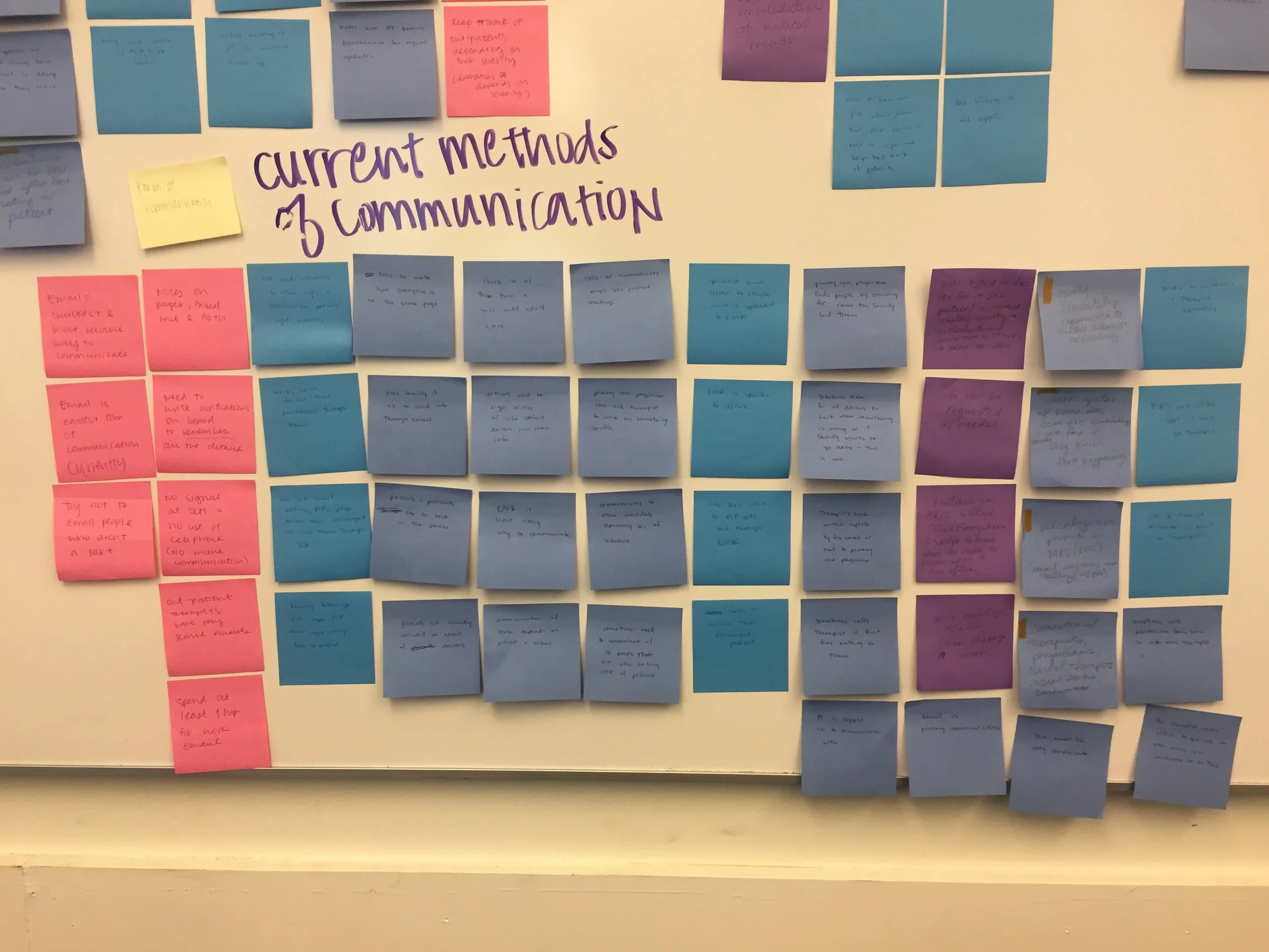
We conducted user interviews with various medical providers, each holding significant roles for recovering patients, followed by a long session of affinity analysis.
We interviewed rehabilitation & physical therapists, and out- & in-patient pediatricians, all playing vital roles in a patient’s recovery. They were asked questions regarding their involvement in the rehabilitation process and their experience using the current method of communication, along with any suggestions to improve communication.
User Interview Participants
The interviews helped us address biggest pain points related to the providers’ involvement in the rehabilitation process and experience with communication amongst each other, as well as with the patient and their family. We reviewed our interview notes and recordings and analyzed through a few rounds of affinity diagramming to develop a main findings themes that arose among all the participants. We gathered three main points from the interviews to focus on for the next phases.
1
Accessing PATIENT INFORMATION
Medical providers are forced to rely on patients and their families for vital information due to lack of communication they have among other providers. Though, with already so much on their plate, patients tend to forget vital information to share.
2
EXTERNAL COMMUNICATION
Communicating with providers outside of the organization is very difficult as it is time-consuming to find their contact information. Also, being unaware of who they are communicating, in terms of experiences and capabilities, can be challenging
3
CONFIRMATION FEEDBACK
Email seemed to be the primary method of communication. However, participants stressed it as ambiguous, without the right feedback to know if their recipients received necessary information sent to them. It put them in a state to risk assumption.
PHASE II:
Planning & Ideation
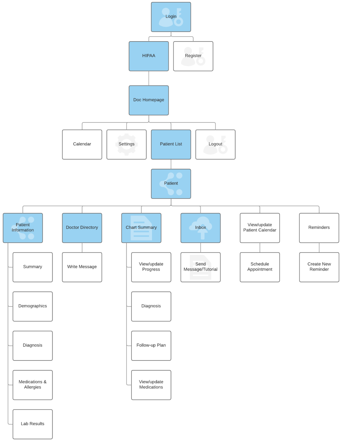
We channeled the gained insight from our findings into our ideation process through personas, storyboards, and developed a sitemap to help determine features that will address the issues presented.
Personas
We drafted three personas, each representing our target users and participants from research. Explanations on their bio, goals, pain points, desires, and scenario were included to have a glance of who will use our platform.
Storyboards
The following storyboards represent how our personas would interact with the application. They show the persona’s motivation for using the product, how they use it, and the benefits of using our application.
Sitemap
The sitemap set up a hierarchical view of relationships between pages, based off of user needs and scenarios. Highlighted in blue are individual pages and in white are categorized information and functions provided within each page.
User flow was emphasized from our storyboards, and pages and features created from research findings.
PHASE III:
Design & Early Evaluation
From ideation and planning, we sketched, wireframed, and evaluated the first iteration of our design. We incorporated main features to entail an easy view of patient information, chart summary collaboration between providers, instant messaging, and provider directory.
Sketches
We displayed our initial ideas on the look, feel and functionality of our application. Finalized sketches were developed after discussing different layouts and features to best meet users’ needs.
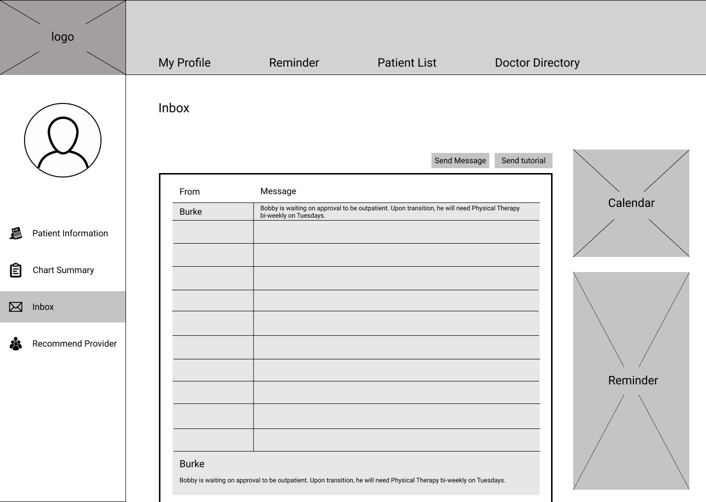
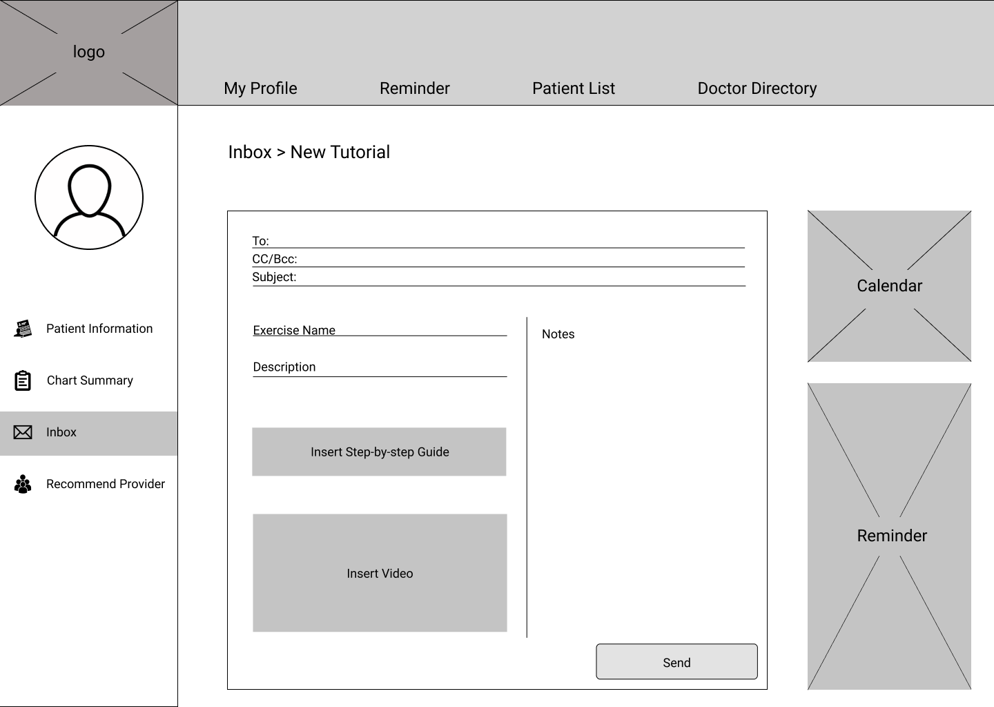
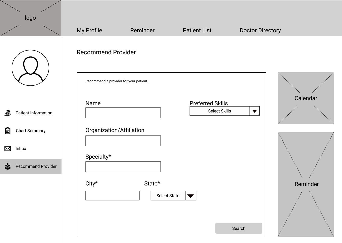
Wireframes
Accumulating everything from previous phases of the project, we organized a main layout, adding components on menu panes to match what were consistently desired and deemed necessary by all the providers we interviewed.
Feedback
Through quick usability testing, we received critical advice to improve the functionality of our application for the next design iteration. Suggestions included: intuitive features, realistic content (such as text), and paving easier user flows.
PHASE IV:
High-Fidelity Interaction
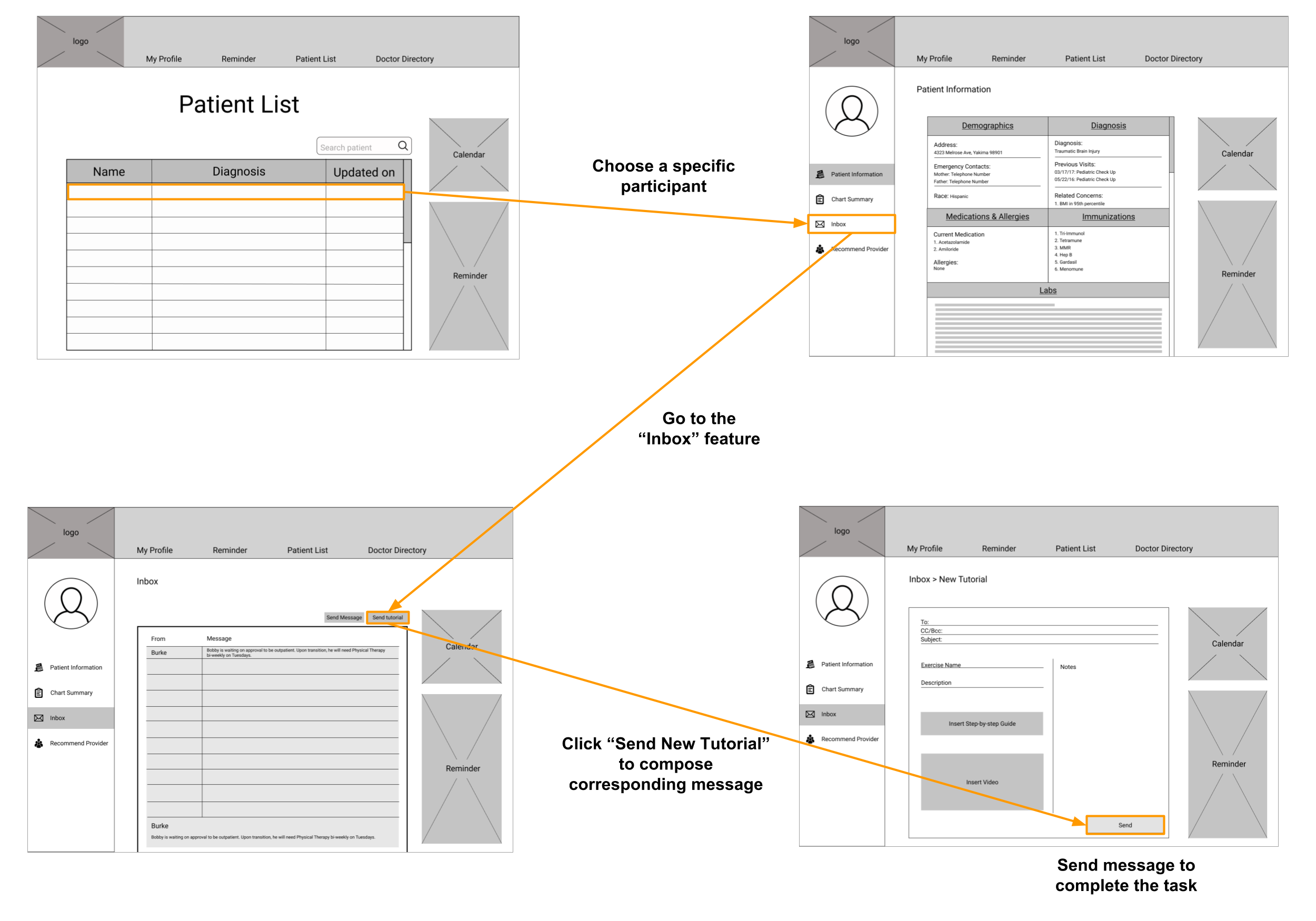
Suggestions from user testing were inputted into a more complete, iterated interface design. This version focused on creating a realistic feel of the application. During the phase, we conducted another testing with target users to ensure our design solves what was emphasized during research, correctly meeting our users’ needs. Highlighted below are key features of the application: collaborative chart summary, communication via inbox, and finding a provider
CHART SUMMARY
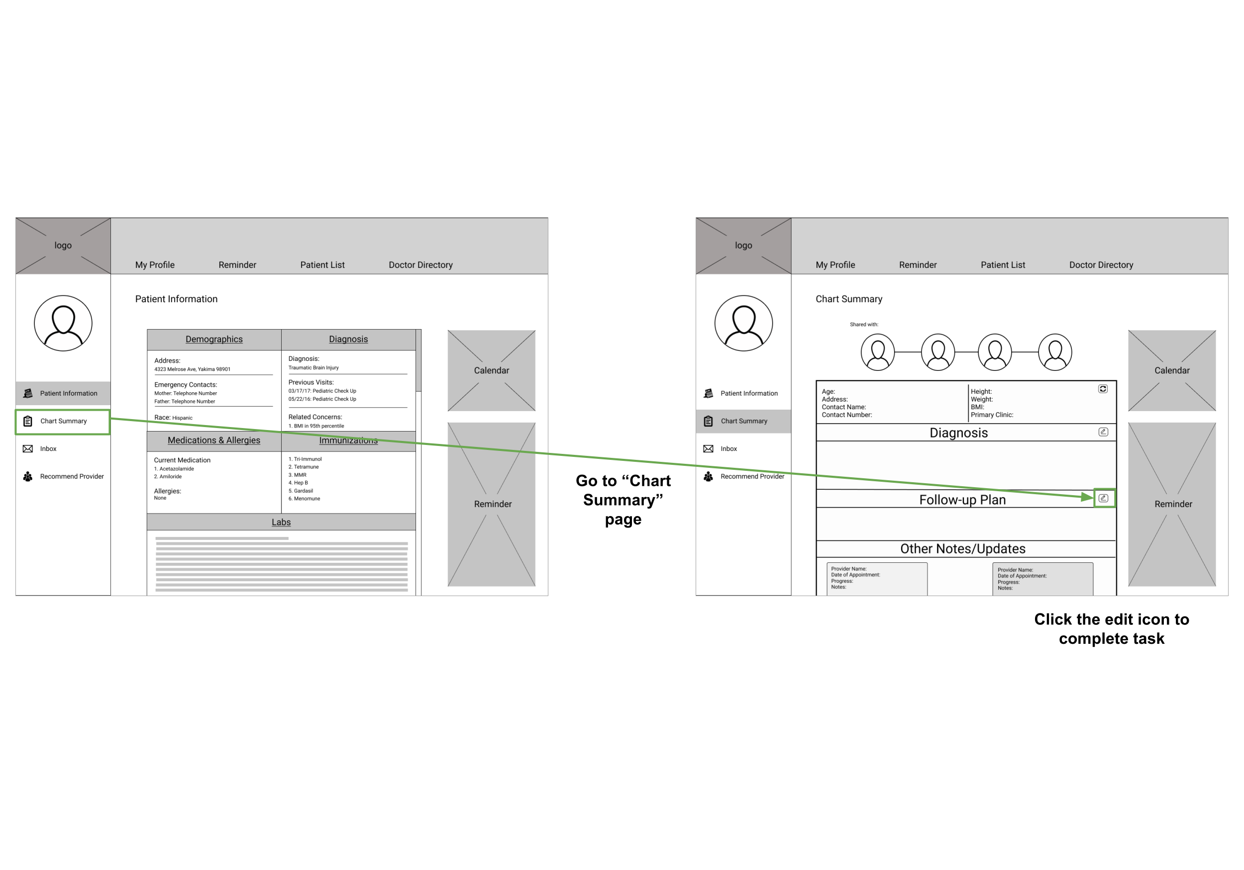
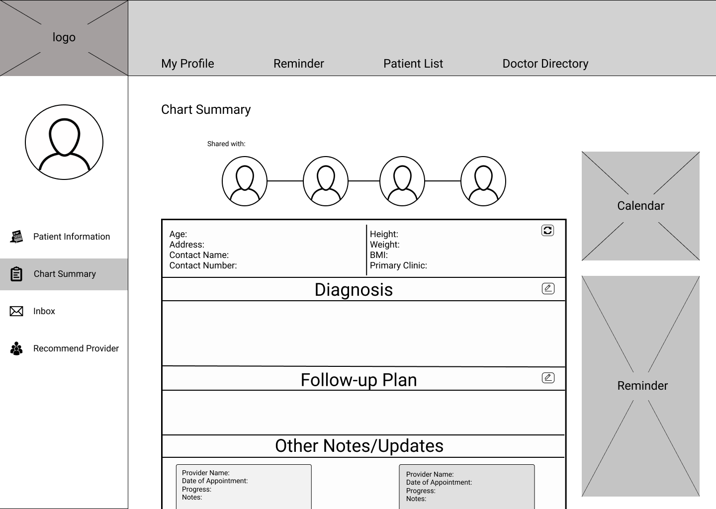
The chart summary enables all medical providers caring for the same patient to monitor and update new information. The feature makes Doc2Doc unique as a medical communication platform, solving the problem of ambiguity between providers.
INBOX
Providers can communicate with anyone playing a role in a patient’s recovery (external providers, patients, parents). The feature acknowledges the expressed need of direct communication on the new platform, that will also create a smooth transition from the current form of communication.
Find Provider
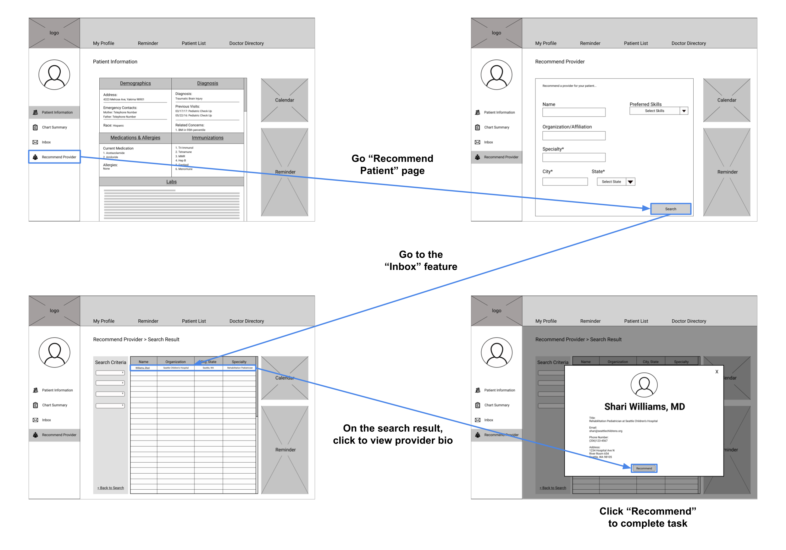
Medical providers are gained the ability to either find contact information on or recommend a specific provider to a patient. The feature is an important solution that prevents users from wasting their time trying to find providers, especially those working in other hospitals.
Phase V:
Presentation
The final stage involved the team to transfer our research into digestible materials, with a poster, video, a process book, and presenting at the departmental open house. This was so that we learn to communicate projects for all audiences to understand.
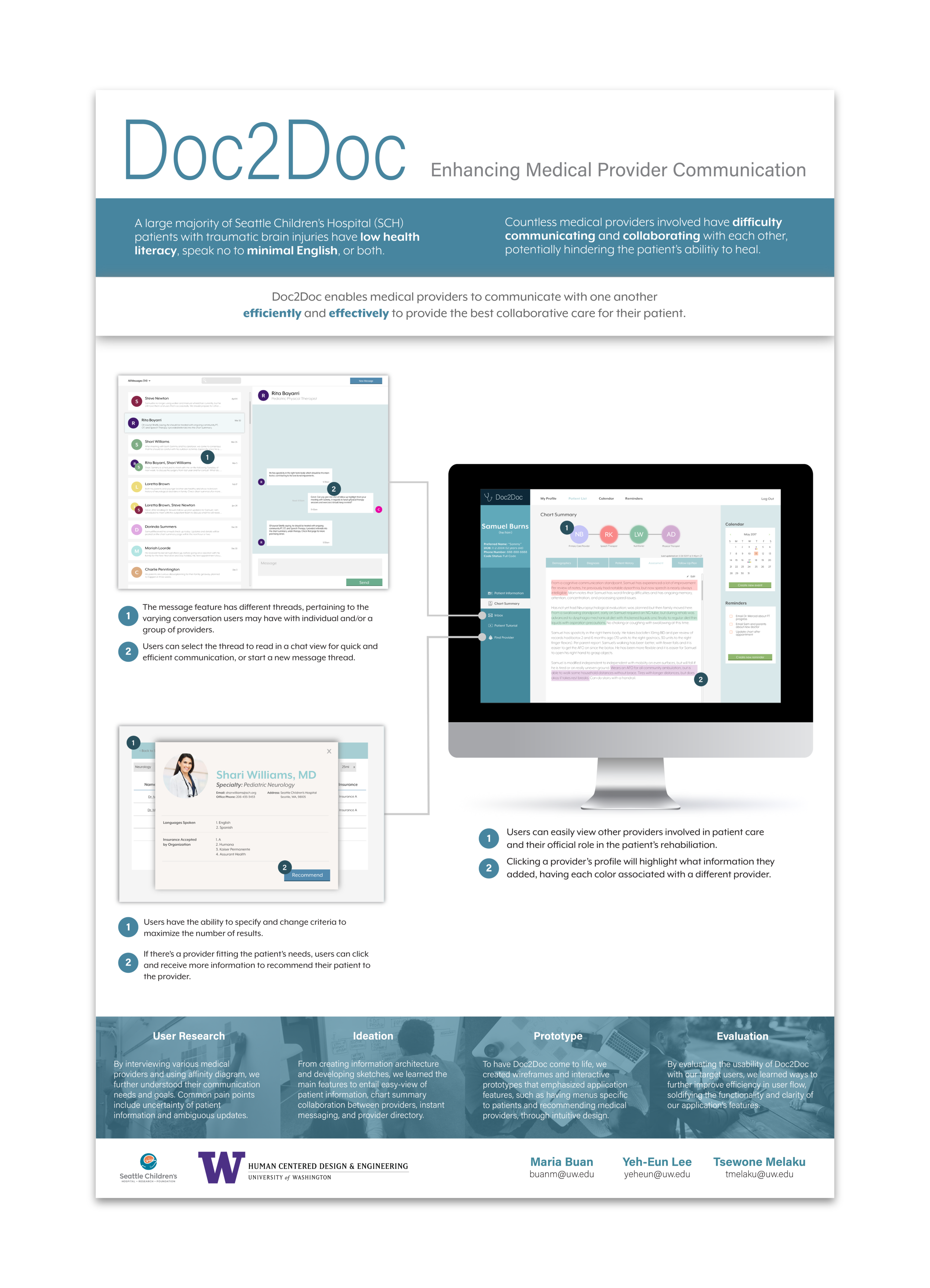
Poster
To celebrate the completion of our project, our department hosted an open house for us to showcase our research findings and ideation. We compiled everything into a poster that summarized our problem statement, our process, and the key features of what is known as Doc2Doc.
Designing the poster added another challenge for my team, as we curate both a narrative and visual layout that can be easily communicated to those who are seeing the project for the first time. With that, our goal for this deliverable was to ensure our audience left our presentation knowing as much of the project as our team.
Recognition: During its early stage, our project proposal was recognized by the College of Engineering to receive a grant towards finishing the project. During the open house, we were presented with a purple ribbon to highlight this recognition.
Reflection
It was a first time for all team members to take on a project from beginning to the end. I’d say, the toughest challenge was for each of us to try and finish all aspects of the project within the allotted timeline while also juggling as a full-time students with other classes and extra-curricular obligations.
Looking back for improvements, I know for a fact that we spread ourselves a little thin. We wanted to ensure all phases and deliverables were fully complete, there were times we rushed ourselves to get it done. Also, there was a point in time when we started to get carried away with minor visual details during design phase which was not necessary as this project was UX focused and not UI.
However, just the fact that we were able to finish the project was a huge accomplishment on its own, and we learned many values about working in teams along the way.
Personally, I learned the value of project management and teamwork (such as effectively communicating with my team my thoughts and any concerns that my crossed my mind). The project definitely tested our capability of being team players which we were all luckily succeed in the end.

