UW Housing & Food Services site
Usability Study // UX Research // UX Design
BACKGROUND
Wrapping up the first iteration of their new site infrastructure and design, the UW Housing & Food Services team reached out for my team to test and ensure the navigation and usability of their potential design were intuitive to the new generation of students.
TIMELINE: Jul 2017 - Aug 2017 (launch: Feb 2018)
MY ROLE: UX Researcher, UX Design Consultant
CONTRIBUTORS: UW Marketing, UW HFS
TOOLS: Optimal Workshop, QuickTime, Google Docs/Sheets/Slides/Hangouts
Context
In 2017, the University of Washington’s Housing & Food Services (HFS) site was in the process of reconstruction. Its infrastructure was significantly narrowed down by about 90%, keeping information concise and categorized into four main buckets. And it was also redesigned to look clean and modern. The four categories were Explore, Live, Learn, and Eat.
That summer, the team reached out to us to evaluate a potential design they prototyped for the HFS website.
Overarching Goal
To fulfill the site’s goal, we focused our study around three main questions:
Is the website enjoyable to use?
Is it easy for users to access the information they need when they need it?
Are important transactions, such as applying to housing, intuitive and easy ?
Our Process
I. Research PREP and Identifying project scope
Heuristic Evaluation
The first step we took was browsing the site on a UX standpoint, focused on the overall user flow, intuitiveness, and how well visuals aligned with UW’s marketing guides and principles. This step gave us a sense of the direction our study would go. Although the new design was significantly clean and visually appealing, we speculated the information architecture, along with many features were not intuitive and very likely to leave the users confused.
Project Proposal & Usability Study Plan
Using notes from heuristic, we drafted a project proposal for the HFS team confirming the overarching goals, usability questions, and ideal flows for users to successfully accomplish tasks.
We agreed to conduct a total of three tests: unmoderated & moderated tree tests, and a formal usability test. Also, we decided it be best to base the tasks around the four main menu options: Explore, Live, Learn, and Eat.
II. Tree Testing
We utilized the Treejack service in Optimal Workshop, to evaluate the top and sub-level menu options. In the activity, the architecture of the website was formatted into series of dropdown menus containing the different pages of the website. The purpose of the activity was to test the user experience of the new site information architecture, targeted on evaluating its efficiency and if it aligned with how users perceived.
Unmoderated Tree Test
A link to a survey tree test activity was given to all participants, pertaining eight tasks reflecting on the main features of the site. Participants were asked to select where they thought certain information might be located using a series of drop down menus. The unmoderated activity took between 5-10 minutes for a participant to complete all eight tasks.
Moderated Tree Test
We also conducted moderated tree tests to provide qualitative support, supplementing and characterizing the patterns in the tree test results. We recruited, mostly prospective students who were touring campus, in a guerrilla setting. They were taken to a conference room and asked to think aloud on the new structure, followed by an interview for feedback.
Drawback
Though the service was powerful, we did face a small limitation, as the entire IA had to be pre-inputted. This meant participants could only select options on the last tier of the architecture. In some ways, users were forced to a path, beyond what they perceived. In that case, we asked during post-test interview where they would have stopped, had it not been for the limitation.
Data Collection
We received a total of 41 respondents: 37 unmoderated and 4 moderated.
Results from the unmoderated tree tests were used to find patterns, such as common paths, success/failure rates, directness rates and the overall score of each task, using quantitative analysis (example on right).
Meanwhile qualitative data collected during moderated sessions were observed alongside, providing a deeper understanding of the motives and reasoning behind participants’ actions.
Tree Test Findings
Some findings specific to the tree tests were:
Navigation was highly learnable, meaning it may not be easy to navigate perfectly at first, but through repeated use became easier
Finding information under Eat was straightforward and easy for participants to understand
Participants wished the path to applying to an undergraduate residence hall was streamlined with fewer steps
There were some locations and lingo that were unfamiliar with participants who weren’t UW students or didn’t live in dorms
Tasks within Learn were the hardest to navigate (finding student jobs and student leadership opportunities) because the actual content did not match participants’ expectations
A thorough report analyzing the metrics, patterns, and recommendations of each task can be accessed through this link.
III. Usability Testing
Upon the completion of tree testing, we moved onto planning on conducting usability tests to focus on the experience of the entire website, incorporating both web content and visuals.
Each session took about 45 minutes to 1 hour each, consisting of pre-test questionnaire, four tasks with post-task surveys, and a post-test interview emphasizing any specific parts.
Tasks
Participants were asked to complete four tasks during the session, each pertaining to the main features. They were:
Examine and apply to a campus housing option
Find an extracurricular opportunity to get involved in
Find the information needed to make a decision about dining plans
Find information about gyms in the residence halls
Counterbalancing
Tasks were counterbalanced to avoid confounding variables and ensure that the order of tasks did not affect the participant’s experience, with no two participants given the same order of tasks.
Participant Recruitment
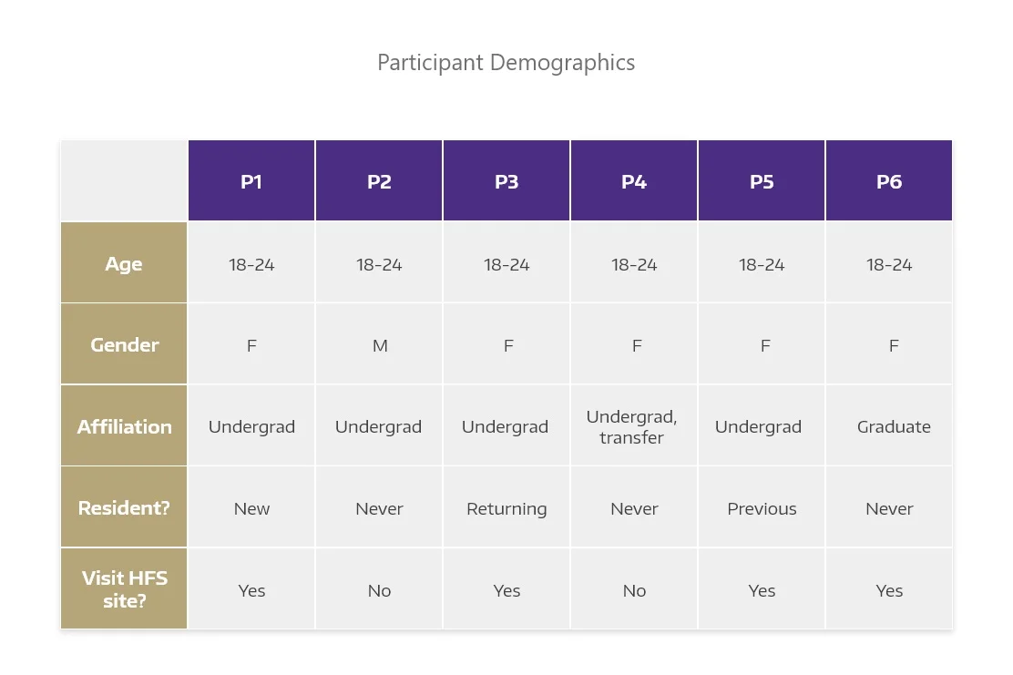
We approached participants through UW community groups on social media, with a screening survey link. Participants were screened based on their age, affiliation to the university, and residential status, trying to select participants representing various demographics. A total of six participants were recruited to test the site.
Test Environment
The test environment always included a facilitator and note-taker present, alternated by my partner and I.
We invited members of the HFS team to observe during some sessions, but limited to one to avoid any risk of participants feeling overwhelmed.
Analysis
We analyzed using the recorded sessions, highlighting observations about pathways participants took, problems they encountered, any comments or recommendations, and responses from post-test interview. Analysis was also in conjunction to tree test findings. We prioritized insights based on the potential impact they would have if solved.
Presentation & Report
All the steps we took to complete the study, including tree test findings, test kit, screen recordings of participants, research method, analysis, and findings were presented to the HFS executives, along with a detailed report on our research findings and recommendations to optimize the HFS site.
IV. General Findings + Recommendations
Overall, the new HFS website design was received positively by participants, such as having welcoming and diverse visuals, clean new design, and great representation of the university.
There were many findings and recommendations in the study, and the following are some of the changes that were taken into consideration for the next design implementation, and currently live site.
Button Design
Some buttons were mistaken as a banner, divider, or didn’t look actionable (as shown). This was problematic at times when buttons lead towards a task completion, to which the designs became a barrier. All participants struggled to identify buttons at least once due to the designs.
Recommendation: We suggested sticking to one consistent design. One design from the version was highlighted that met the standards, ensuring users it was clickable. Labeling buttons with the relevant action, such as “Go to X page,” “Learn more,” etc was also highly recommended.
Text Hierarchy
There was ambiguity caused by lack of text hierarchy between varying texts, as they looked very similar in size and color. In addition, there was not enough space between blocks of text, making it hard for participants to distinguish the text’s purpose.
For example, in one page a header and a linked text were close together and very looking similar, causing participants to feel momentarily lost, with some even giving up because they could not identify the correct link.
Recommendation: As people most-likely associate colored texts to be linked, we suggested to have headers not colored, reserving colored texts for links. Also, to have more space between grouped content.
Texts in tiles
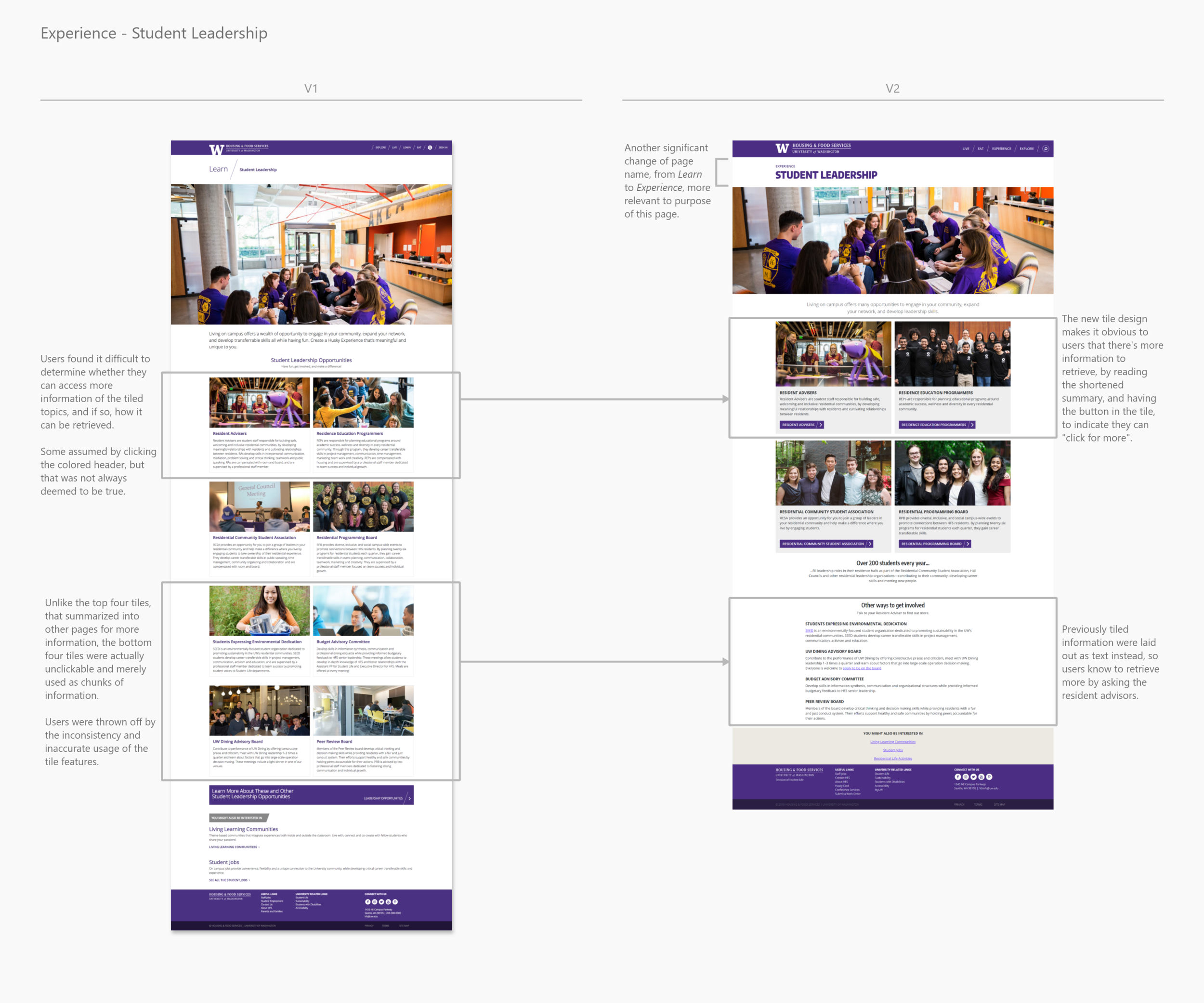
Texts in tiles, especially were confusing for participants, since the headers had similar font size and color as linked texts, deceived as clickable, when in fact they were not. Also, the purpose of tiles were inconsistent, as some were used as summaries leading to more detail, and others to just categorize information.
Recommendation: We advised the team to only incorporate tiles for the summaries and not categorized information, and adding in obvious visuals, such as buttons with actionable labels, for users to quickly scan and know where to click for more information.
Content Hierarchy
One intention of the new design was to guide users to explore throughout the site. However, it resulted in placing important details and links at the bottom. For that, many participants had trouble finding desired information, as they searched mostly at the top. Even when they found it, some commented, “Why is everything at the bottom?” and rather voiced there was too much scrolling involved.
Recommendation: We suggested keeping information straightforward and prioritizing the location of important details and links to the top, allowing users to find information quickly.
V. Page-Specific Findings + Recommendations
Main findings of this study were categorized into four main pages of the site (Explore, Live, Learn, Eat) upon presentation.
Explore // Hovering text & picture correlation
The Explore page had a feature where hovering over a picture would highlight text that guided users to a page. Unfortunately, the intention deemed unsuccessful, as 4 out of 6 participants voiced concern.
Primary reason involved the hovered text being not apparent, having participants misinterpreting the Explore page as merely a photo gallery without understanding its functionality. They referred to the texts as “hidden words”, suggesting the feature to be omitted, rather.
Another comment we repeatedly heard from participants was that there was no correlation between the photos, texts, and the page they were linked to.
Recommendation: To alleviate uncertainty, we suggested choosing photos with clear and strong connections to the page they linked to, highlighting a successful example of a clear match between photo, text, and link.
Explore // Would participants utilize the page?
The purpose of the Explore page was to incorporate fun, exploratory, and interaction features to engage users. During post-test interview, we asked participants how likely they were to utilize it.
Most answered yes, but not necessarily with the way the page was currently set up. Confusing layout and organization left some to feel overwhelmed, and the current usability issues undermined the intention.
Participants also thought it was futile to have multiple tiles leading to the same page, and all only to the high level pages, when they could use the navigation bar to directly access those pages in fewer clicks.
Recommendation: In order to increase users’ chances of utilizing the Explore page, we recommended having a large breadth of specific site pages or helpful external resources linked.
Live // Trouble finding residence halls and apartment
During tree tests, this task carried a 90% successful completion rate. However, during the usability tests, 5 out of 6 participants struggled. They also rated the task as most difficult. This showed that there was an element beyond information architecture. We observed the button design, labeling, and placement to have significant effects.
Participants struggled to identify the design as a gateway to residence halls. They were persistent to complete the task, but some gave up because they simply could not identify where to click. Even when some reached the desired page, they commented that the button’s design looked more like a banner.
Recommendation: We analyzed there were three potential reasons for this difficulty and recommended that:
Have button label be more actionable
Use a clear button style to appear obviously clickable
Move the button higher to be visually related to the page content
Learn // Page name intuitiveness
Participants’ mental model of the name Learn did not match the page content, which consisted of extracurricular opportunities for residential students. Even during tree test, when we asked participants to guess the content of each menu item, most perceived Learn to relate to study groups or an elaborate version of the Explore page.
The only way some participants were able to gauge was when they entered the page and read its tagline up top. Even then, two participants were still left confused. When asked if they would have still known the page content without the tagline, they all said no.
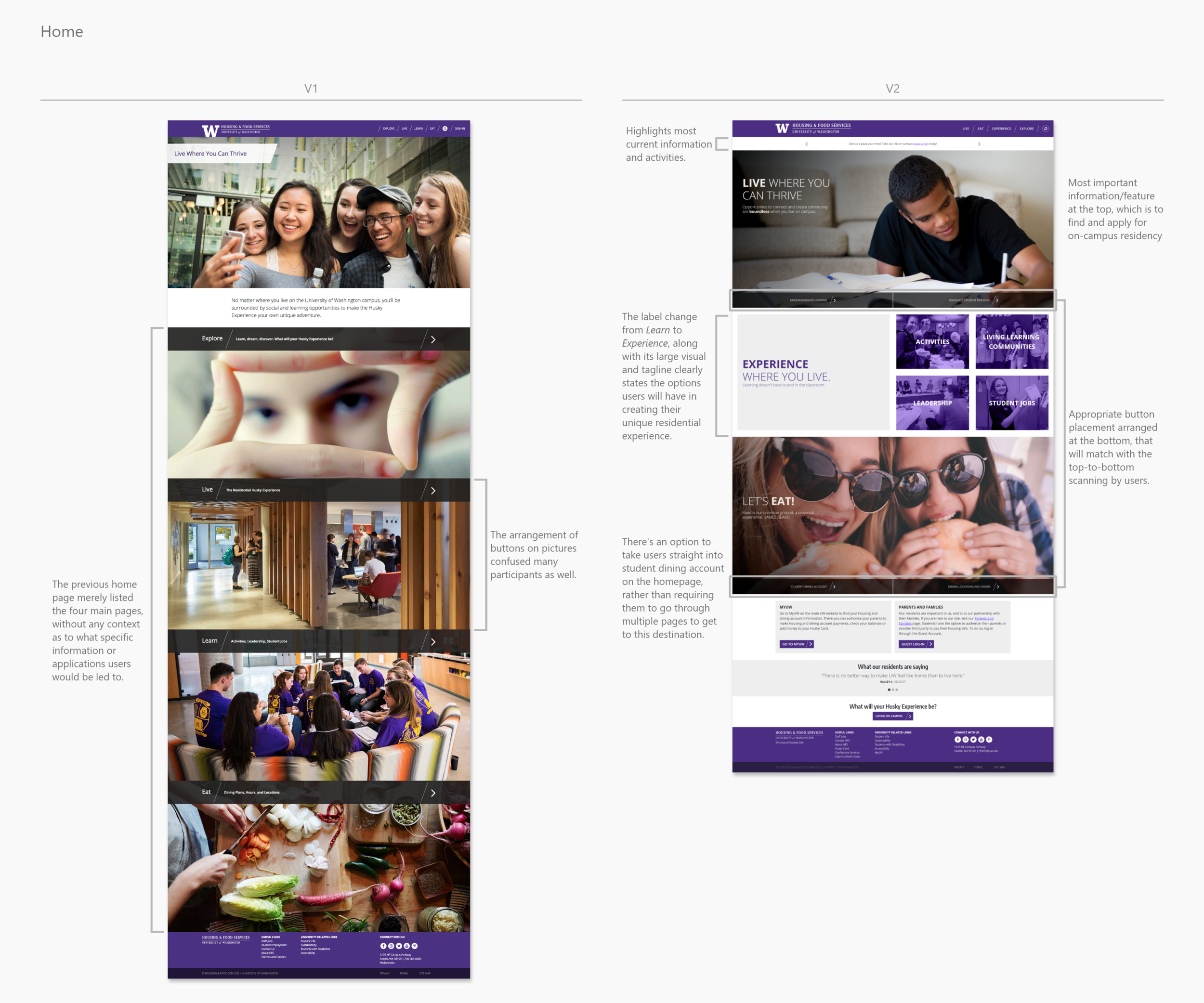
Recommendation: We recommended renaming the Learn page so it is self-explanatory. It would help users avoid confusion and allow them to find the opportunities they may be looking for. Now, this page is labeled as Experience in the current site.
Eat // Student dining account
When asked to find information to decide on dining plans, participants did not know or were not confident in clicking “Student Dining Account” as the correct option. The button label was misleading because it did not accurately reflect the label and page content, as participants assumed it to lead to an account login and not information. Even when they came across the button, many were hesitant to click it because there were no context to the site.
Recommendation: We recommended changing the label to something more reflective/suitable, such as “Student Dining” or “Dining Plans”, as well as adding context with the button, for it to serve its full purpose, and participants to click with confidence.
V2 HFS site
All findings and recommendations were taken into consideration in implementing a second version of the site design. Overall, all V2 pages were shorter, as they became succinct with information reduced down to the most important details. Significant changes made generally throughout the site included having good content and text hierarchy, with primary information placed at top, features laid out to be organized and intuitive, and visuals setting an even more welcoming vibe for the users.
Some specific changes between V1 and V2 are highlighted below.
Reflection
I dove into this project my first week working as a User Experience intern for the UW’s marketing team. Having prior projects be more conceptual, it was both nerve-wracking and exciting to work on an actual product that would be launched. It was a whole new learning experience, as I had to actively practice the fundamentals and exercises I took in my major. One key skill I developed was knowing how to improvise the original plan in order to go with the current flow of the project.
Wrapping up the project affirmed the importance of user experience in extending the effectiveness and powerfulness of a product. The smooth communication and partnership dynamic between my team and the HFS team also exemplified having good teamwork.
Going Further
For future research, we suggested to try having secondary users, such as parents and high school advisors, testing the site to see if the experience would be the same for them as it is for the students.


